BRAND IDENTITY AND WEBSITE FOR GINA, FABULOUS VIRTUAL ASSISTANT

Gina is a London-based virtual assistant with years of experience in corporate and professional environments. In 2021, she decided to stop being placed by agencies and start finding clients in her own right. She needed a brand and a website that would make her discoverable, credible and unmistakably her.
-
Gina came to me without a fixed brief. She knew she wanted to promote herself online, but wasn’t sure exactly what that involved. In our early conversations, we worked out what she actually needed: a visual identity she could use consistently across every platform, and a website that would tell people what she did and how to get in touch.
She wanted to be taken seriously. She’d spent years being highly competent in environments that didn’t fully reflect her. Going out on her own was as much about identity as it was about income, and the brand needed to show that.
-
Brand strategy
Colour palette
Typography
Logo design
Brand identity assets
Photography art direction (magnolia and faceless business theme)
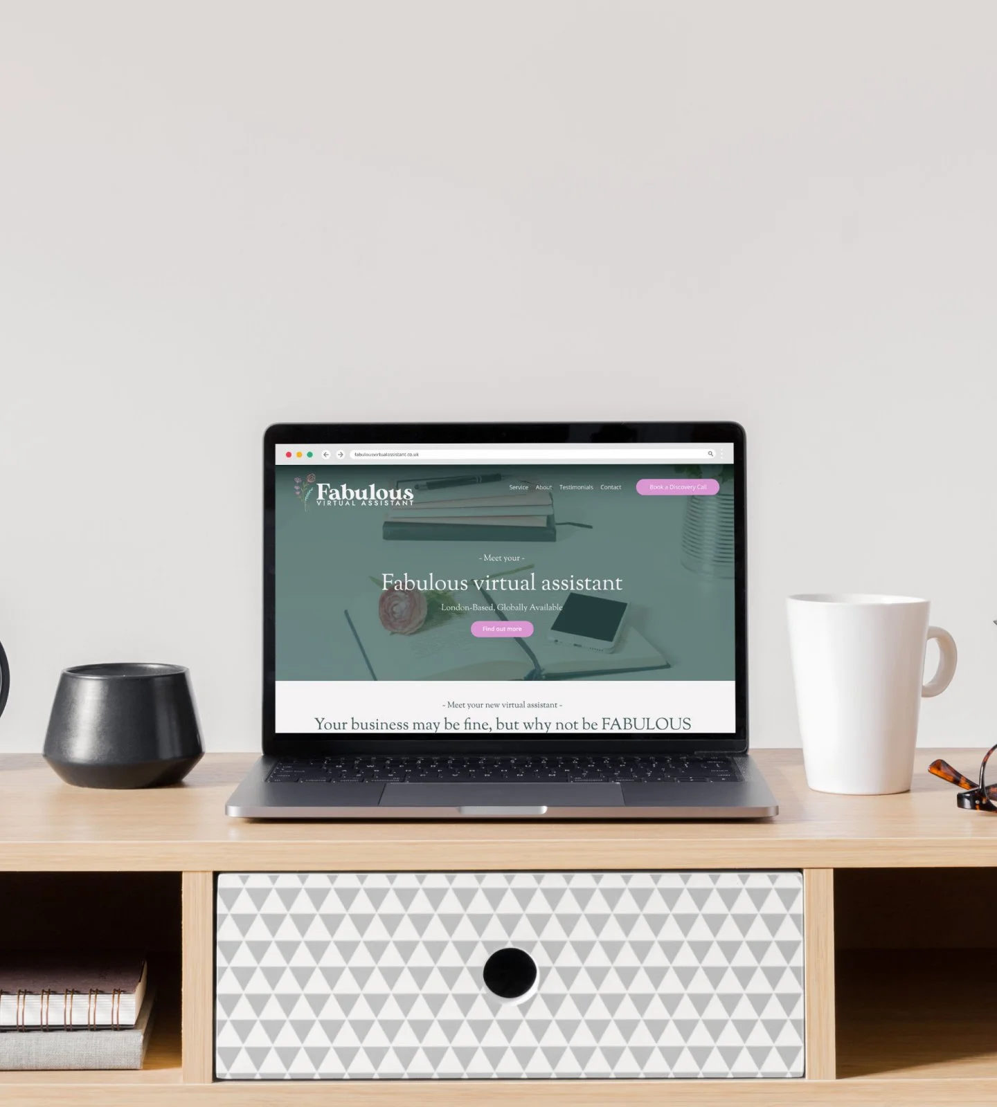
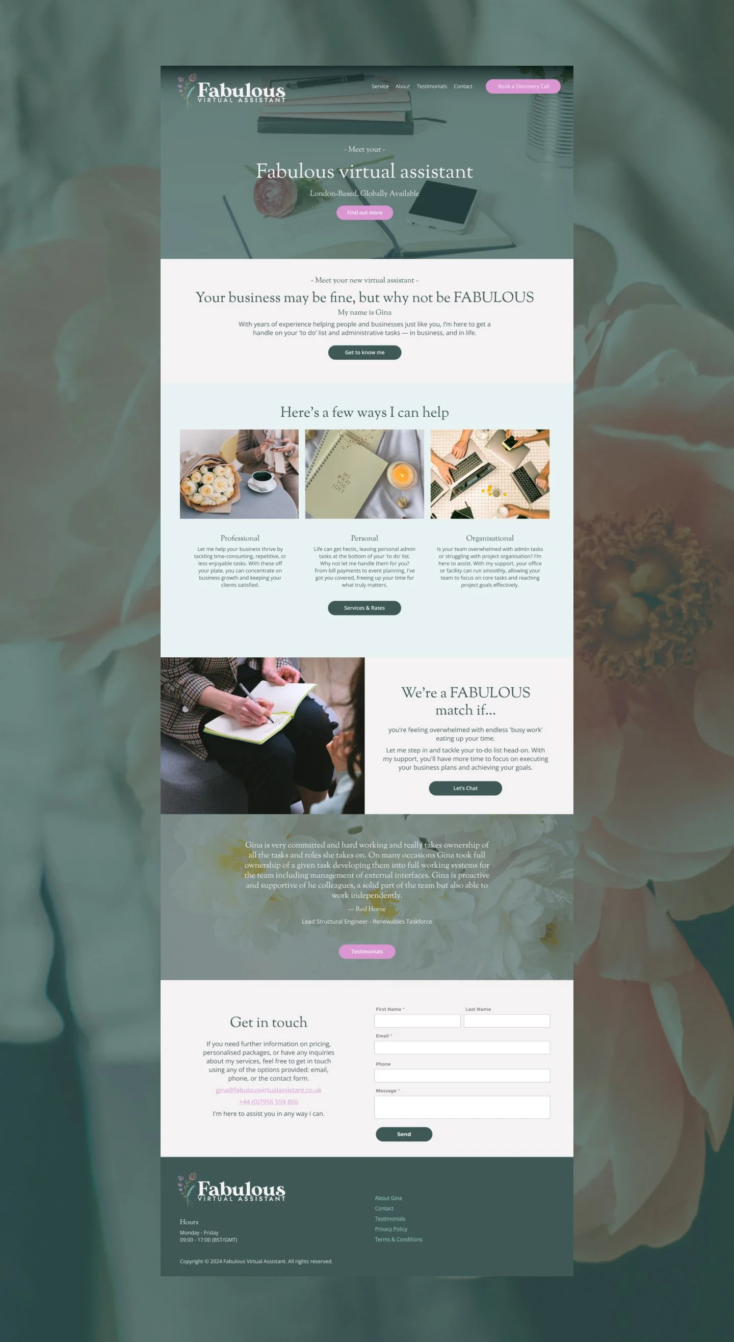
Squarespace website — five pages
Website copywriting
SEO setup
-
The strategy happened through conversation. I asked Gina about the kind of clients she wanted, how she wanted to be perceived, and what made her different. What came through clearly was that she’s meticulous, warm and takes real ownership of the work she does — not how every VA operates, and worth making visible through the brand.
Her favourite brand was Tiffany & Co, which gave us an anchor point for the visual direction. I developed a palette in the same spirit. A soft, elegant blue-green with cream and white, that felt refined without being cold. Gina also chose not to put herself visually front and centre, which led to a deliberate decision to build the brand around her favourite flower, the magnolia. Graceful, structured and quietly distinctive: the right fit.
The website was structured around what a potential client would need to know before getting in touch. We kept the copy direct and warm, with Gina’s own word — “fabulous” — running through it as a natural thread.
-
The colour palette draws from Tiffany’s signature blue, softened into a warmer tone and paired with cream and white. The result is clean and airy, polished without feeling corporate.
Typography pairs a refined serif for headings with a clean sans-serif for body copy. The magnolia appears throughout: in photography, in graphic elements, in the overall visual tone of the site. Rather than relying on photography of Gina, we used curated images, workspaces, flowers, faceless business photography, that felt cohesive and intentional. The brand looks personal without being dependent on a single face to carry it.
-
Fabulous Virtual Assistant launched in 2021 and has been live since. Gina has secured two long-term, steady clients. The kind of retainer-based work that matters most for a solo operator. She went from being placed by agencies to being discoverable in her own right, with a brand that matches the quality of her work.
In a market where VA brands tend to look the same, Fabulous Virtual Assistant stands out. The Tiffany-inspired palette and magnolia identity give it a look that is recognisably Gina’s, and her clients respond to that.
KIND WORDS
“Purdie was a joy to work with on my Virtual Assistant website! She guided me through the strategy process effortlessly, helping me define my target audience and bringing my vision to life with a stunning design. Her talent and support made the entire experience delightful. I highly recommend Purdie to anyone seeking a talented partner in brand development”
— Gina: Founder of FVA
Like the look of this project? Let’s chat here!
If you’re stepping out on your own and need a brand and website that do justice to your experience, get in touch.