
Umara Jewellery – Brand Identity, Packaging & Shopify Website Design

Umara Jewellery is a conscious, luxury gold jewellery brand founded by Priya in Devon. The name ‘Umara’ means “lifetime” in Punjabi, reflecting the brand’s promise of quality, longevity, and timeless style. Priya approached me to create a visual identity, packaging, and Shopify store that would communicate luxury while staying fresh, inclusive, and relevant to a new generation of jewellery buyers.
-
Umara’s audience values investment pieces — customers aged 25–40 with a substantial disposable income, seeking jewellery that lasts a lifetime. Priya’s vision was for a brand that appealed beyond the traditional affluent white female market, resonating with a wider, more diverse audience. She wanted a brand identity, packaging, and online store that felt both high-end and approachable, with 10% of profits supporting communities in India where the jewellery is crafted.
-
We began with a detailed brand discovery questionnaire to define Umara’s purpose, values, and audience. This guided the design process from strategy through to execution.
Priya had colours in mind, but my focus was to create a palette that would stand confidently on its own, complement the gold jewellery, and nod subtly to cultural influences without overpowering the products. The typography combined two unique, complementary fonts — sophisticated and modern, versatile enough to stand alone or work together seamlessly.
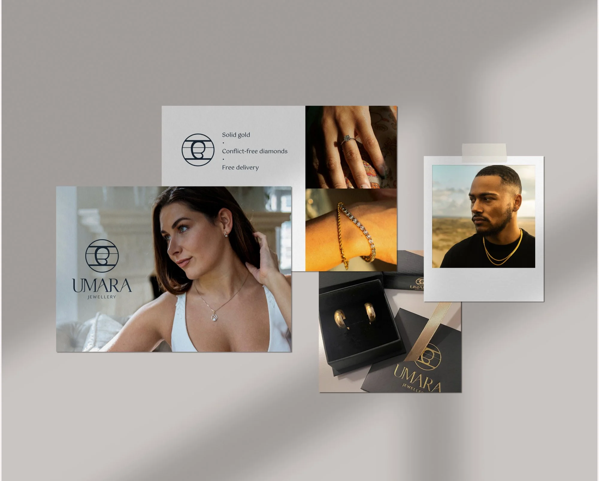
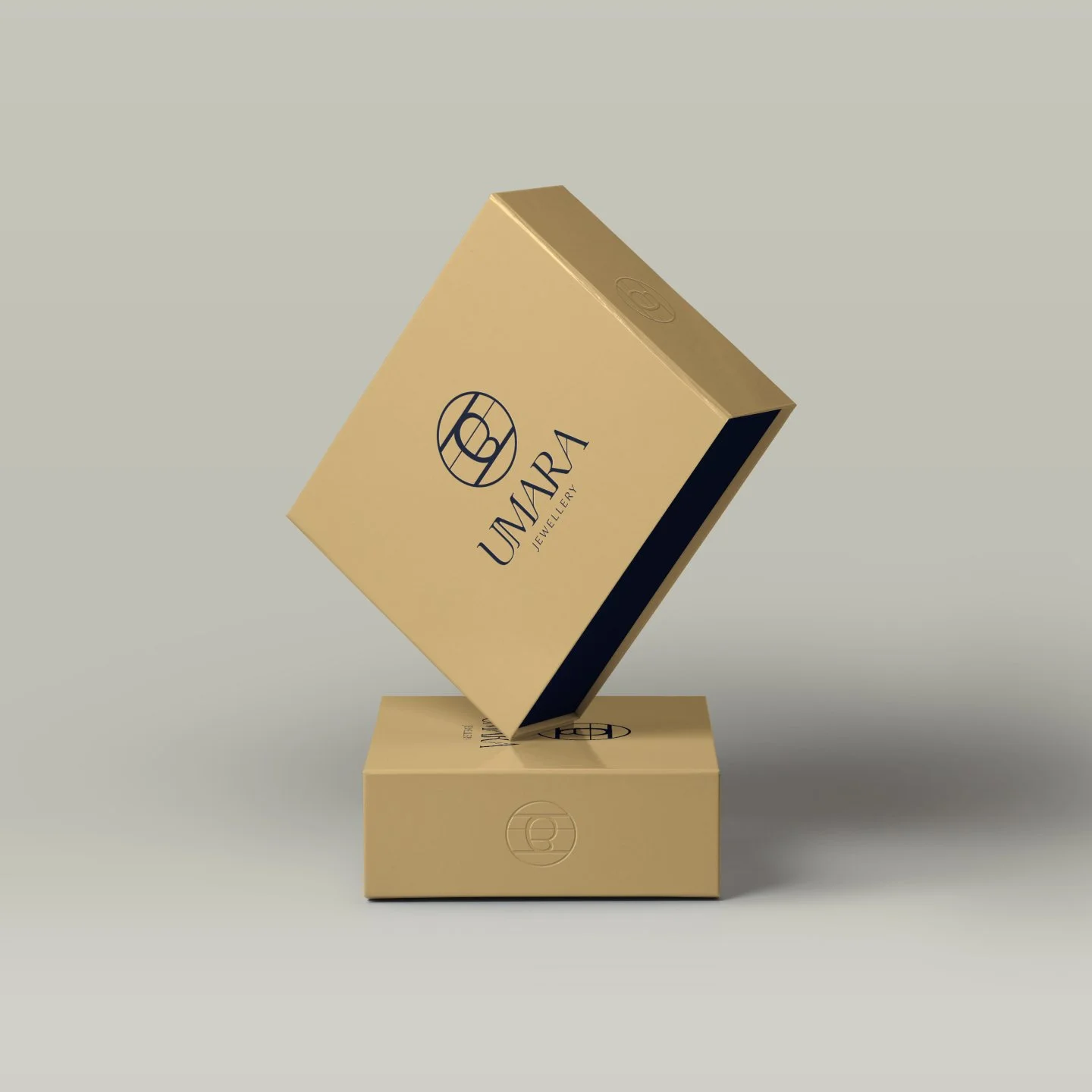
I hand-drew the Umara logo mark to give it a personal, tactile quality — aligning with the brand’s story and artisanal roots. This became the centrepiece for minimal yet bold packaging, where the restrained use of colour allowed the logo to shine.
-
The final brand identity balances elegance and modernity:
A refined colour palette complementing the warm tones of solid gold jewellery.
A distinctive, hand-drawn logo mark used across packaging and marketing materials.
Packaging that tells a story — from the first impression of the outer box to the certificate of authenticity inside.
Printed materials, including postcards for customers and trade shows, all produced to exact specifications and coordinated for delivery to multiple locations.
For the Shopify site, I set up the structure, pages, and product listings, ensuring a smooth user flow and visual consistency with the brand identity. I also directed the photography style — showcasing strong, confident, and diverse models in a way that allowed the jewellery to remain the focal point.
-
Since launching, Umara has grown steadily over three years, with a clear, confident visual identity that Priya can apply across all areas of her business. The brand’s strong foundations allow her to focus on creating and promoting her products, supported by a design toolkit that reflects the quality and values of the business.
Like the look of this project? Let’s chat here!
I’d love to create a brand and packaging design that tells your story beautifully.