BRAND IDENTITY AND GUIDELINES FOR THE EUROPEAN ANIRIDIA CONFERENCE
The European Aniridia Conference is the world's leading scientific event focused on a rare, complex genetic eye condition affecting 1 in 47,000 people. Every two years it brings together the world's top ophthalmologists, scientists, geneticists and vision scientists alongside people living with aniridia and their families. I was brought in to create the conference's first-ever brand identity, along with a set of guidelines and a sponsorship pitch deck to support the fundraising effort ahead of the 2020 London edition.
-
After four editions of the conference, there was still no independent brand to speak of. Each host organisation had applied their own identity, resulting in something inconsistent and unremarkable for an event of genuine international scientific significance. With the 5th edition approaching (to be held in London, with the scientific programme led by a team from Moorfields Eye Hospital and UCL), the organisers needed to change that.
Before they could approach potential sponsors, they needed materials that reflected the calibre of the event. And the brand had to do something quite specific: feel connected to both Aniridia Network UK and Aniridia Europe without being owned by either, because future editions would be hosted by different national organisations. It also had to meet WCAG 2.1 colour contrast requirements from the outset, a non-negotiable given that many of the conference's own delegates and audience members live with visual impairments.
-
Brand identity concept and development
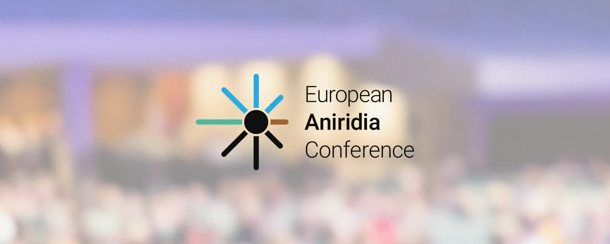
Logo design: wordmark with starburst icon
Full logo suite: landscape, portrait, standalone icon, black/white, coloured background variants
Accessible colour palette: primary colours and background variants, WCAG 2.1 compliant
Typography system with fallback guidance
Partnership lockup system
Brand guidelines document
22-slide sponsorship pitch deck
Additional slide templates for ongoing use
Vector and raster file delivery
-
The central creative challenge was building a brand that could speak convincingly to two very different groups at once: world-leading scientists who would judge its credibility, and people living with a complex visual impairment who needed it to be accessible. Every decision was shaped by that tension.
I ruled out an eye motif early: too common in the medical sector, not distinctive enough. Stars and EU-blue palettes were out given the conference's need to feel international rather than regionally political. What I landed on was a starburst icon radiating from a central black circle. The radiating lines reference light spreading outward, connected to both the experience of aniridia and the idea of knowledge and research moving into the world from a concentrated gathering of experts. The central black circle references the enlarged pupil characteristic of the condition. The mark works at very small sizes, which was important given social media and digital use cases.
The colour palette (sky blue, teal and warm brown alongside black) had to pass WCAG 2.1 contrast checks for both white and black text. I tested every combination and documented the results in the guidelines, including noting where initial specifications had been adjusted to meet accessibility standards. Darker tonal variants were specified separately for use as text backgrounds. None of the colours were borrowed from either Aniridia Network or Aniridia Europe, giving the conference genuine visual independence.
The sponsorship deck was structured to move from conference overview through to scientific committee credentials, delegate statistics from Paris 2018, and tiered sponsorship packages. The Paris figures were compelling: 75 professionals from 29 countries, 100% reporting their objectives were met, 70% reporting significantly improved knowledge of aniridia. Building those numbers into the deck gave prospective sponsors a reason to believe in the event.
-
The wordmark sets 'European Aniridia Conference' in Heebo, a clean, highly legible geometric sans-serif, with 'Aniridia' in medium weight to draw natural emphasis to the condition name. Heebo was chosen for its legibility at small sizes and the clarity of its weight differentiation. Montserrat was specified as a fallback for contexts like Google Slides where Heebo was unavailable. Both typefaces are free via Google Fonts, which kept adoption accessible for a volunteer-run organisation without a font licence budget.
The brand guidelines were designed to be used by people without a design background, including future host organisations who would pick up the identity in two or four years' time. The 'what not to do' section was explicit enough to prevent misuse without requiring anyone to interpret the intent of the guidelines. The partnership lockup system gave clear guidance on how to sit the EAC mark alongside sponsor and co-organiser logos, using the starburst's geometry as the spacing reference.
-
The European Aniridia Conference went into its 2019/2020 fundraising cycle with a brand identity for the first time. A conference that had borrowed assets from host organisations for four editions now had something it could call its own: a professional, accessible identity built to travel across organisations and years.
The London 2020 edition was cancelled due to the COVID-19 pandemic. The identity and guidelines remain available for when the conference next takes place, and the work done to build the sponsorship deck stands as a record of what the event was capable of presenting to the world.
KIND WORDS
“We worked with Purdie to develop a visual identity for the European Aniridia Conference. The outputs were a logo and brand guidelines plus templates for slide decks and a sponsorship brochure.
The design process was highly iterative. We needed to cater for visually impaired patients, medical professionals and funders. Purdie worked with us through several rounds, starting with diverse concepts then a second imaginative spread as we explored new options. She was responsive to our feedback as we honed the designs, helping to ensure good contrast for accessibility and flexibility for formats and sizes. The final assets were excellent.
As hoped, the value of the work became clear over time. Since 2020, the assets have been used at a conference for around 80 people, every two years. Each time the event is run in a new country by a different group of relatively inexperienced volunteers. Having a strong established brand package saves the organisers effort and ensures the event has a consistent, quality appearance over time. Purdie provided us with a reliable, long-term resource that has significantly simplified and improved the execution of our conferences, enabling many more successes to flow from them.”
— James Buller, Head of Communications and Membership, Aniridia Network UK
Like the look of this project? Let’s chat here!
If you're building something from scratch, or trying to make what exists finally feel like you. I'd love to hear about it.