BRAND IDENTITY, PACKAGING AND SHOPIFY WEBSITE FOR UMARA JEWELLERY

UMARA Jewellery is a conscious, luxury gold jewellery brand founded by Priya Faith in Devon. The name ‘Umara’ means ‘lifetime’ in Punjabi — a reflection of the brand’s promise of quality, longevity and timeless style. Priya approached me to create a visual identity, packaging, and Shopify store that would communicate luxury while staying fresh, inclusive and relevant to a new generation of jewellery buyers. Four years on, UMARA has been featured in Tatler, Refinery29, Men’s Health, Wolf & Badger, The Handbook News and Drinkuff.
-
Priya’s audience values investment pieces — customers aged 25 to 40 with a substantial disposable income, seeking jewellery that lasts a lifetime. Her vision was for a brand that appealed beyond the traditional fine jewellery market, resonating with a wider, more diverse audience. The brand also had a social mission built in: 10% of all profits go back to the communities in India where the jewellery is crafted. The identity, packaging and online store needed to feel high-end and approachable in equal measure.
-
Brand strategy and audience personas / Wordmark design / Symbol design (hand-drawn and digitised) / Colour palette and typography system / Brand guidelines / Packaging design / Certificate of authenticity / Jewellery care cards / Shopify website build / Photography direction / Social media templates / Postcard design and print management for pop-ups and trade shows
-
We began with a detailed brand discovery process to define Umara’s purpose, values and audience. Priya and I worked through three customer personas — mapping how each person shops, what they value, and why they’d choose UMARA over anyone else. That thinking shaped every creative decision that followed.
Priya had colours in mind, but my focus was to create a palette that would stand confidently on its own, complement the gold jewellery, and nod subtly to cultural influences without overpowering the products. The typography combines two complementary fonts — sophisticated and modern, versatile enough to work alone or together.
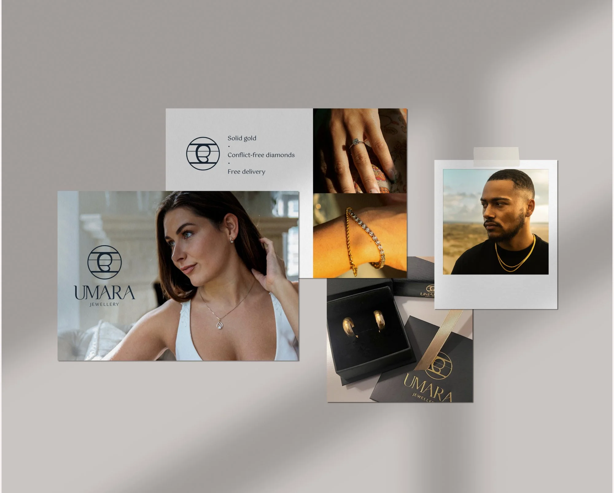
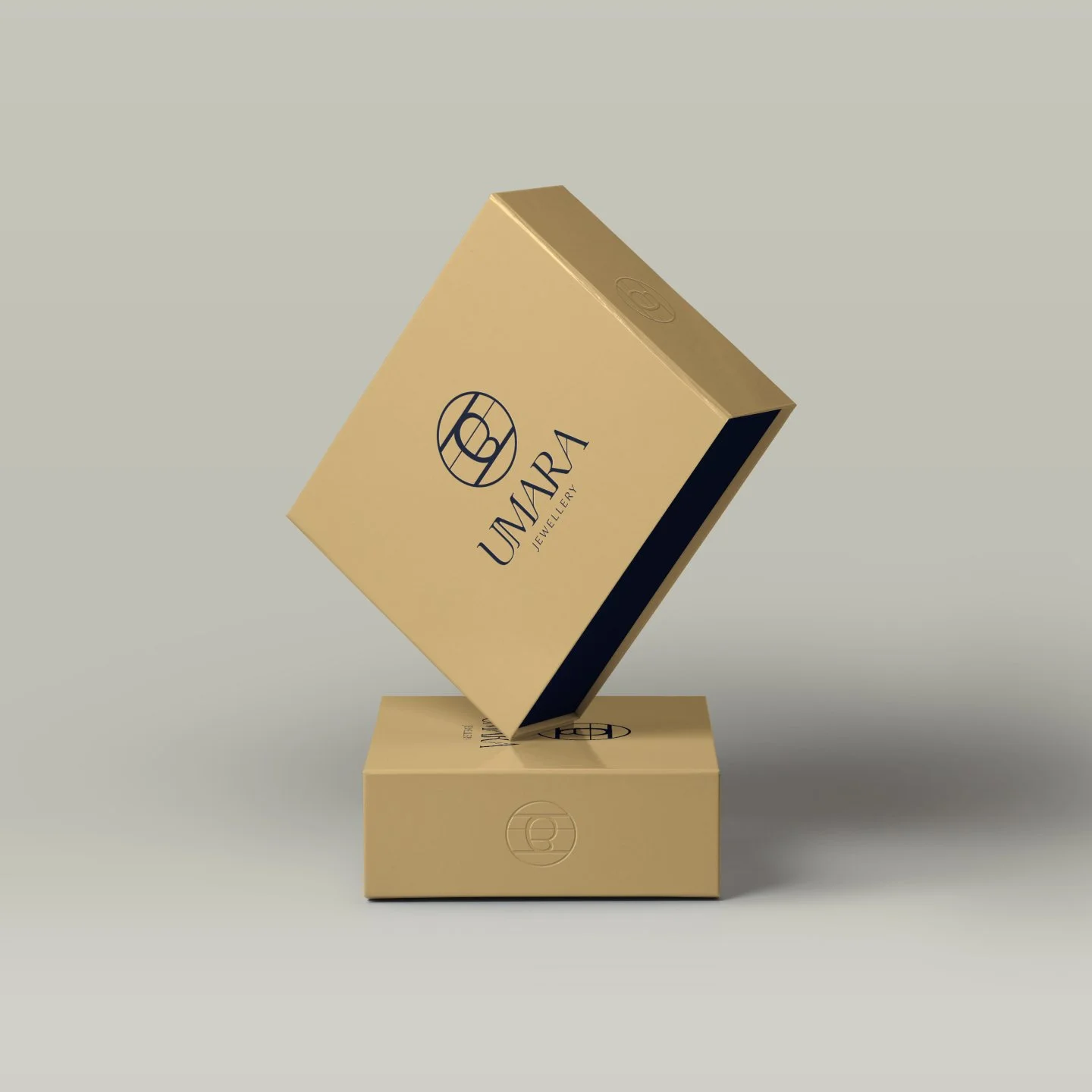
At the heart of the identity is the Punjabi symbol for ‘lifetime’ — a literal translation of the brand name into visual form. Priya supplied a reference image. Rather than tracing it digitally, I drew it by hand in pencil first, then transferred and refined it into a clean, smooth line. The result feels authored, not assembled — carrying the tradition and sentiment Priya wanted without leaning on cliche.
-
The final identity balances elegance with modernity. The hand-drawn symbol became the centrepiece for minimal yet bold packaging — restrained use of colour letting the mark take centre stage. The packaging tells a story from the first impression of the outer box through to the certificate of authenticity inside. Printed materials, including postcards for customers and trade shows, were all produced to exact specifications and coordinated for delivery to multiple locations.
For the Shopify site, I set up the structure, pages and product listings, ensuring a smooth user flow and visual consistency with the brand identity. I also directed the photography style — showcasing strong, confident and diverse models in a way that kept the jewellery as the focal point.
-
UMARA launched in 2021 and is now celebrating its fourth anniversary. The brand has been featured in Refinery29, Tatler, Wolf & Badger, Men’s Health, The Handbook News and Drinkuff, and has built an audience that reflects exactly the community Priya set out to reach. The strong foundations give her a design toolkit that works across every part of the business — so she can stay focused on creating and promoting her products.
Like the look of this project? Let’s chat here!
I’d love to create a brand and packaging design that tells your story beautifully.