BRAND STRATEGY, IDENTITY AND SQUARESPACE WEBSITE — JESS BAYLY YOGA
Jess Bayly is a yoga teacher, breathwork facilitator and retreat host based in London. Her practice is built around slow living, embodied movement and the connection between physical and emotional wellbeing. When she came to Purdie Studio, she had a loyal following and a growing retreat programme but no brand to carry it. This project was a full brand strategy, visual identity and Squarespace build — including a second identity for her retreat brand, Half Moon Retreats — designed as a flexible platform that her team could continue to grow independently.


-
Jess's practice had grown through word of mouth and Instagram, but she had no consistent visual identity and a WordPress site that no longer reflected where she was heading. Someone discovering her online for the first time would have no sense of the depth or quality of what she offers. The visual identity needed to feel like the practice itself: fluid, organic and with room to breathe.
The website had one primary job: to support her retreat programme, with landing pages that could be created and launched as new locations were confirmed throughout the year, and a brand her team could run independently without needing to come back to a designer each time.
-
Brand strategy, values definition and audience profiling
Tone of voice guidance and SEO keyword research
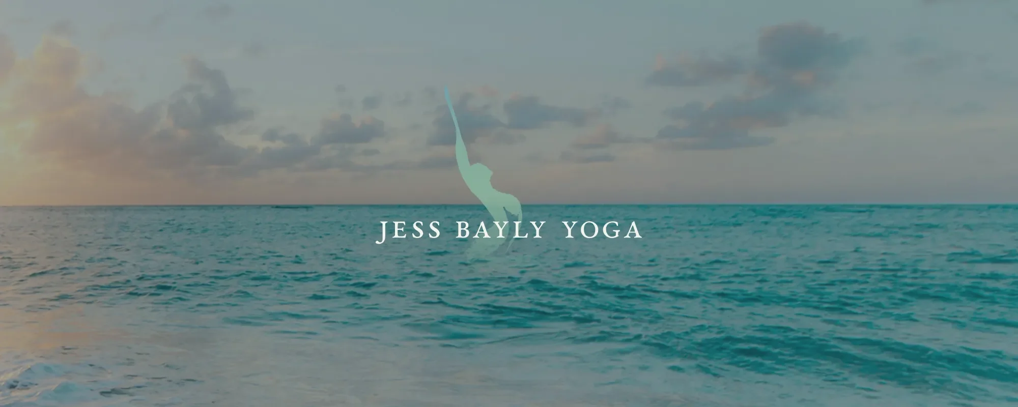
Custom watercolour figure mark for Jess Bayly Yoga
Half Moon Retreats mark — half moon with figure
Colour palette with named colours and typography system
Full brand guidelines
Figma wireframes for home, about and retreat pages
WordPress to Squarespace migration and domain transfer
MailChimp integration and legal pages
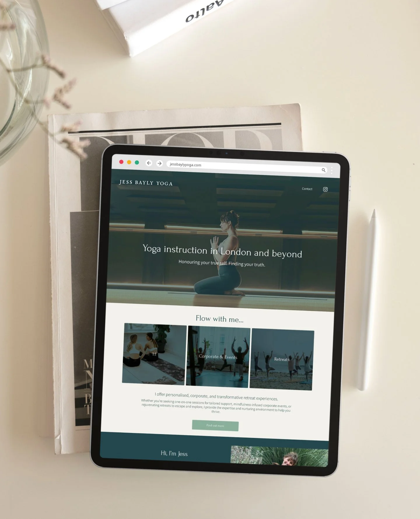
Squarespace website — home, about and retreat landing page template
Business card, tote bag and Instagram highlight covers
-
The project started with a brand strategy session - a conversation rather than a questionnaire. Jess talked about her practice, her values and the feeling she wanted to create. What emerged was a clear foundation: values rooted in the genuine language of her practice, and a picture of her ideal client as someone with a busy, successful life who has achieved a great deal but does not know how to stop.
Three visual concepts were developed, each taking a different position on colour and feeling. The first surfaced what was not quite right. The colours felt too strong. The second brought the soft blues and muted pinks that would eventually anchor the palette, but the typography needed more clarity. The third brought it all together: vibrancy, natural grandeur, elemental luxury. By the time it was presented, the groundwork done together had already given a strong sense of what would hit the mark. Jess saw it and knew immediately.
Figma wireframes were agreed before the Squarespace build began. Because Jess did not have content ready, the wireframes included drafted copy as a framework, a starting point to write from rather than a blank page to fill. For the website, the approach was to build a template system rather than a fixed site, giving Mila everything she needs to create and publish new retreat pages independently as the programme grows.
-
The Jess Bayly Yoga identity is primarily typographic, with a supporting watercolour mark: an abstract figure in flow, developed from a pencil sketch Jess had drawn herself and used in her newsletters. It was redrawn in watercolour in an upright orientation — organic and hand-made, without feeling rough.
The Half Moon Retreats identity grew from an unexpected moment. Jess noticed a painted dot from a separate painting practice and immediately saw a connection to her retreat brand. The dot became a half moon, and the watercolour figure was placed rising from within it. Two identities, one creative thread, and a retreat brand that did not require a separate brief or a second project to exist.
The palette draws on sea colours and earthy tones: two depths of jade green, a muted coral, a soft skin-tone pink and warm sandy backgrounds. Each colour was named in keeping with the world of the practice. The type pairing, a semi-serif with a clean sans-serif, was chosen for softness as much as legibility, reflecting the same balance between structure and flow that runs through the whole identity.
The website is image-led throughout. The retreat pages let the locations speak. France, Mallorca, Portugal, Sri Lanka, the English countryside. The photography fits naturally because the brand palette and the world Jess photographs in are closely aligned.
-
Jess has a brand and online presence that reflects the depth and quality of her practice. What began as a single brand commission became two connected identities: Jess Bayly Yoga and Half Moon Retreats,sharing the same creative thread.
The template system made it possible for Mila to promote new retreats quickly, consistently and independently. With that infrastructure in place, Jess and Mila were able to plan retreat locations a year in advance, making their marketing seamless across Instagram, the newsletter and the website. Retreats regularly sell out, with spaces filled quickly when cancellations arise.
The retreat programme has been featured in Conde Nast Traveller's guide to the best yoga retreats for beginners, with Jess quoted directly and jessbaylyyoga.com credited. Recognition that reflects the quality the brand now projects, not just the quality of the retreats themselves.
KIND WORDS
“A dream to work with. You really enquired about what we needed, took time to understand Jess, her personality and her vision. Throughout the project, you were super communicative, went above and beyond to make sure Jess was happy and that the brief was not only met but surpassed. A beautiful website with an easily adaptable template which has enabled us to easily create a new page for each retreat. You really dedicated and made us feel like we were your only clients.”
— Mila: Project Manager
Are you ready to bring your brand vision to life? Let’s chat here!
I'd love to build a brand and Squarespace website that reflects the depth of what you do.