BRAND IDENTITY AND WEBSITE SELENEXR
SeleneXR is a London-based startup using 3D computer graphics, AI, and gaming technologies to create digital doubles and virtual content for the fashion industry. Founders Michael and Nicholas Millea had pivoted from a talent agency to a fully digital model and needed a brand identity and online presence that matched their new direction. The project delivered a complete visual identity, a live Squarespace landing page, and a full digital setup — from business cards to social media profiles.

-
Michael and Nicholas came to me at an important inflection point. SeleneXR had a compelling vision, using the kind of technology behind blockbuster films and video games to create more reliable, cost-effective content for fashion brands. But nothing visual to show for it. They needed a professional presence, fast, that would hold up in front of investors and fashion industry contacts.
The brief was for something simple and cost-effective. But Michael brought a strong creative perspective from day one. References ranging from Prada's minimalism to Patagonia's sense of purpose, and a genuinely interesting starting point in the brand name itself. Selene is the Greek goddess of the moon: a body that shines through reflected light. That gave us somewhere to go that was more interesting than standard tech branding
-
Brand questionnaire and discovery
Logo development — multiple options, final direction selected by client
Full colour system — four-colour palette
Typography system — Raleway (headings) and Lato (body)
Brand board / guidelines document
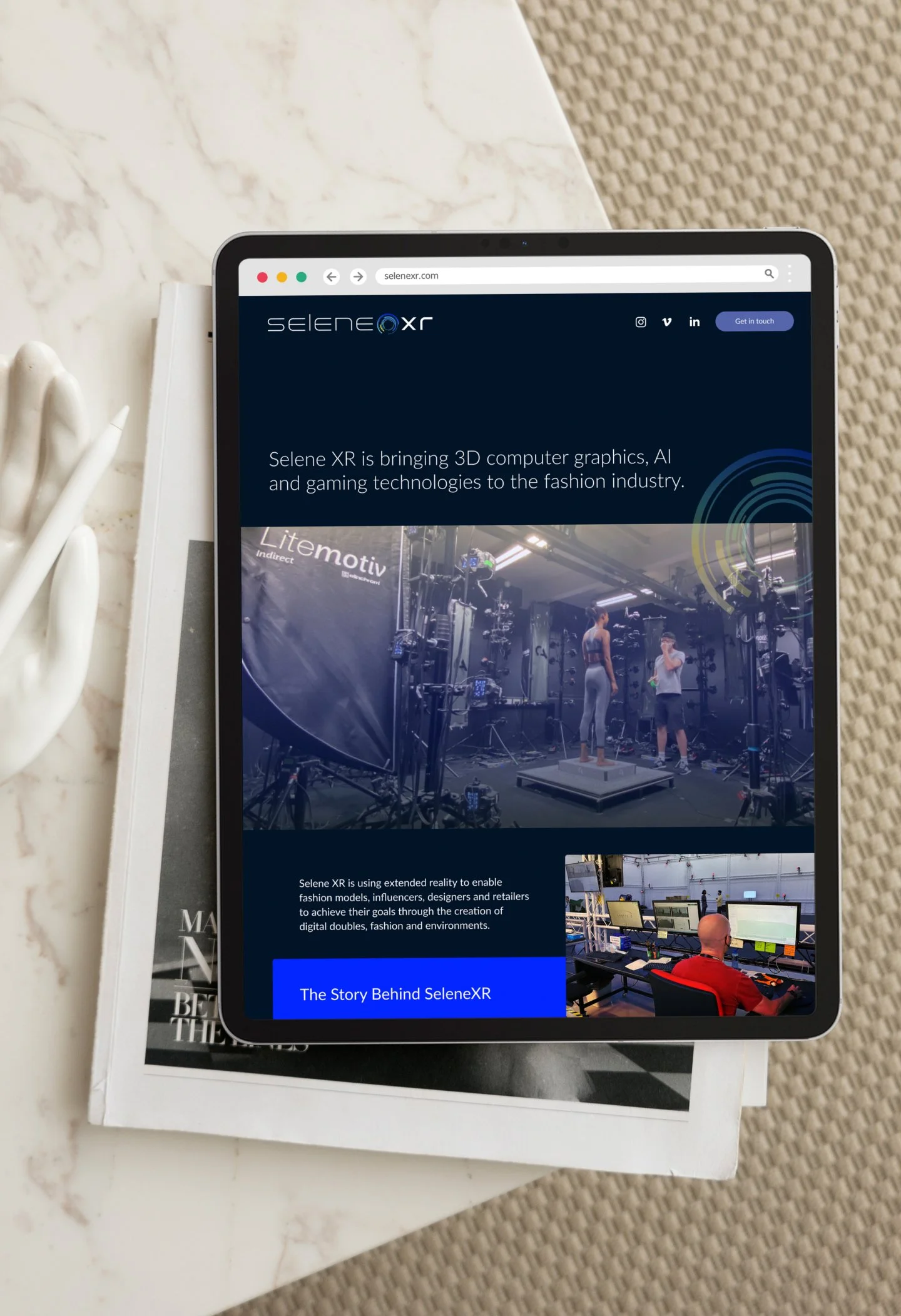
Squarespace one-page website — built and launched
Promotional video integration
Business cards — two designs, print-ready
Email signature
Instagram, LinkedIn, and Vimeo account setup
Domain connection
Asset delivery via Dropbox
-
The name was the starting point. Selene, the moon goddess, uses reflected light to shine, and SeleneXR borrows from reality to create something new. That mythology gave the brand a depth that pure tech visuals rarely have, and it shaped every creative decision that followed.
The logo became a lowercase wordmark, where the 'O' is replaced by an orbital circle motif: part moon, part lens, part render target. Precise without being corporate. Multiple directions were explored before Michael selected this as the direction to develop.
Colour responded to Michael's own instincts: he sent lens flare references early in the process and described wanting something celestial, cool, and bluish-silver in tone. The final palette combines a deep navy (#0C2340) as the brand anchor, electric blue (#0025FF) and mint teal (#6FD5D0) in a gradient that runs through the icon, and a warm yellow-gold (#E0C500) to prevent the palette from reading as cold or purely technical.
The website was intentionally lean. A single Squarespace page with behind-the-scenes imagery, the promotional video, and a direct email call-to-action. It was designed to work as a credibility tool for investor and client conversations, not to be a full marketing site.
Beyond the website, the project covered everything needed to launch digitally: business cards, email signatures, Instagram and LinkedIn profiles, and a Vimeo account, all using the same visual system.
-
The orbital 'O' in the wordmark does a lot of work. At full size it's an intricate circular form suggesting depth, rotation, and precision. At small sizes — in the email signature, as a profile picture, as a favicon — it becomes a distinctive, recognisable mark on its own.
The deep navy (#0C2340) was a considered choice. An earlier lighter blue read as generic tech; moving to the deeper shade gave the brand immediate credibility and sophistication. Michael's first reaction when he saw it was uncertainty about whether it was dark enough, and then, looking again: 'I quite like it.'
Raleway pairs naturally with the geometric precision of the logo. Lato handles everything else: versatile, readable, and warm enough to keep the brand from feeling cold.
The Instagram grid was designed as a visual system, not just a profile, but a coherent editorial structure with branded highlights (BTS, Technologies, Inspiration, Q&A, Client) that would give the account shape and purpose from the first post.
-
SeleneXR launched with a coherent brand across every digital touchpoint. The site remained live for several years. A measure of both the stability of the Squarespace build and the longevity of the visual identity.
Michael described the finished work as looking 'really good' and noted the email signature worked more reliably than anything they'd used before. More meaningfully, the brand gave them something credible to stand behind when talking to investors and potential clients. At a stage when that kind of presence matters most.
The site gave Michael and Nicholas the confidence to present SeleneXR to the world as the business they intended to build, before it had fully become that business yet.
KIND WORDS
“Partnering with Purdie transformed our startup. From brand identity to business cards and website design, she guided us seamlessly. Her knack for asking the right questions sharpened our focus on our target audience, resulting in streamlined and impactful designs. The final outcome exceeded our expectations, perfectly capturing our brand essence. I wholeheartedly recommend Purdie to any founder seeking a talented ally in brand development.”
— Michael Millea
Like the look of this project? Let’s chat here!
I’d love to help you create a simple, impactful Squarespace website to launch your business or test an idea.