BRAND IDENTITY, WEBSITE AND COLLATERAL FOR ALICE CONNOLLY DIETITIAN
Alice Connolly is a Registered Dietitian with over fifteen years of NHS clinical experience. When she set up her private practice, she needed a brand that communicated professional credibility and genuine warmth in equal measure. We built it from the ground up: brand strategy, visual identity, a Squarespace website, and later a promotional flyer to carry the brand into print.

-
Alice came to me with no brand, no website, and no visual identity. She had a decade and a half of clinical experience, a clear philosophy, and a frustration with the gap she kept seeing: women with complex health conditions being offered generic plans by practitioners who didn’t take the time to understand what was actually getting in their way.
Her brief was specific. The brand had to communicate that she was a proper healthcare professional with serious clinical credentials. It also had to feel warm, down to earth, and non-judgemental, because the women she worked with had often been failed or dismissed before they found her. She didn’t want anything clinical, corporate, or dated. She wanted: cool, personal, down to earth, approachable, unusual.
-
Brand strategy and positioning
Logo design
Visual identity — colour palette, typography, brand board
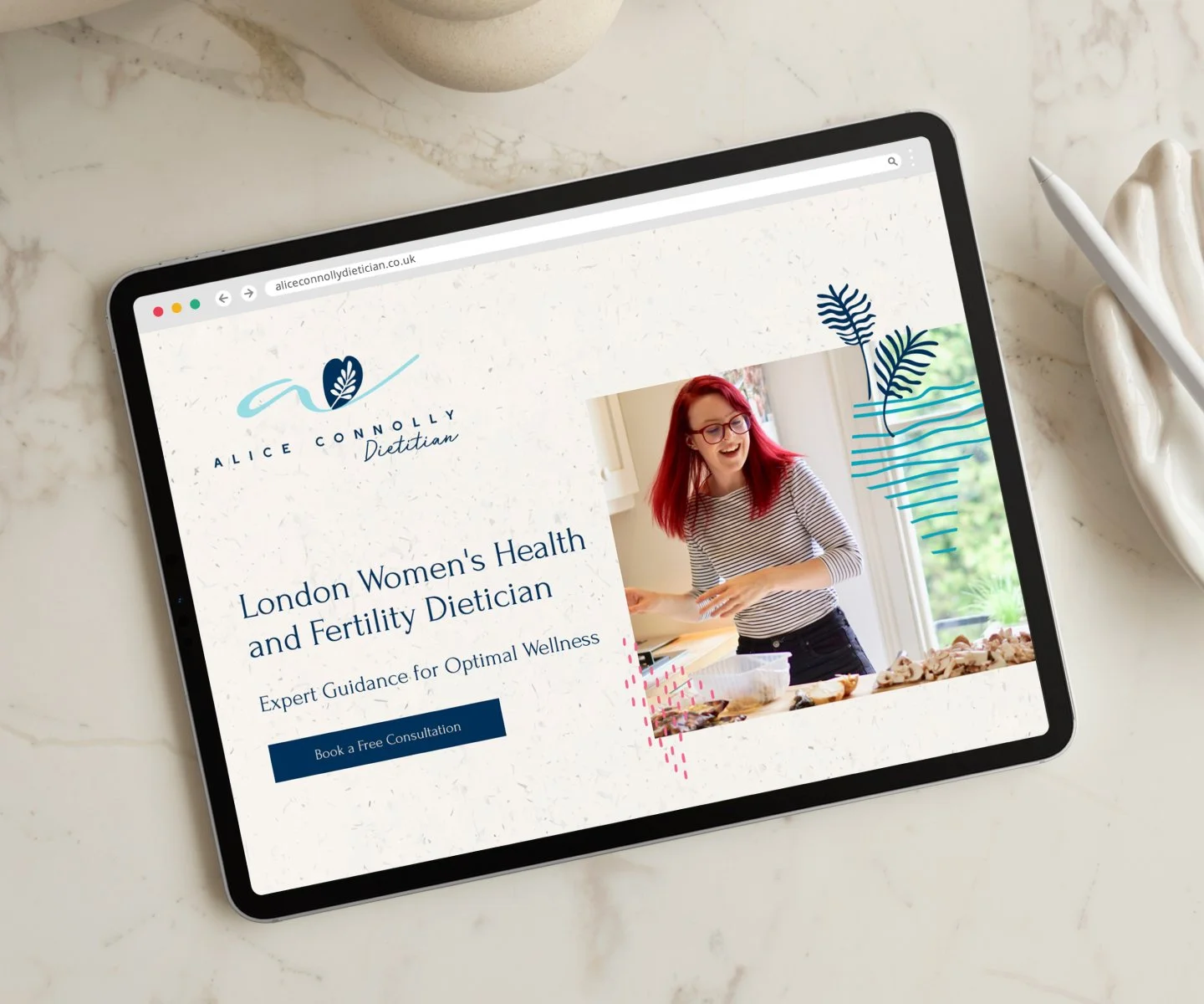
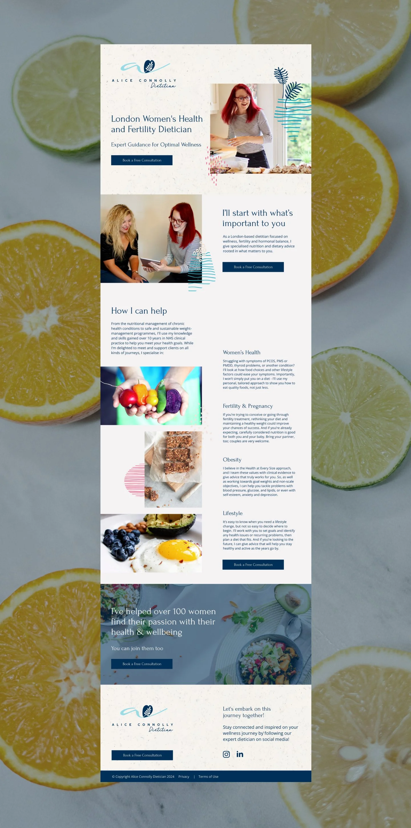
Squarespace website design and build
Website copy direction
Domain setup and booking system integration
Business card design
Promotional flyer — A5 single-sided with QR code
Print sourcing and management
-
Alice’s differentiator was already inside her own story. Early in her career, she discovered that one question changed everything about how she worked: ‘What makes this important to you?’ That question became the strategic anchor for the whole brand. The website headline, ‘I’ll start with what’s important to you’, came directly from Alice’s own language. It said something her competitors weren’t saying, and it said it plainly.
I worked through twenty logo directions before narrowing to the options that best captured the brief. Alice consulted a group of her ideal clients throughout the process and fed back their responses alongside her own thinking. Because she engaged with the reasoning behind each direction rather than just reacting to how things looked, the refinement process moved quickly and confidently.
I directed the copywriter who built the website copy, ensuring Alice’s own voice ran through everything. The About section drew on a piece of writing Alice had shared unprompted at the start of the project, describing the clients who inspired her and the moment her practice changed. The result was a site that read like something Alice had said, not something written for a generic healthcare brand.
The build involved additional problem-solving around domain setup and booking integration. Alice’s original .uk domain wasn’t supported by Squarespace, so I advised on purchasing the appropriate domain and connected everything correctly. I worked through multiple solutions for the booking system, liaising directly with one provider’s support team before landing on an approach that worked, and consulted another Squarespace specialist to resolve a technical constraint. Alice had a working booking route in place by launch.
-
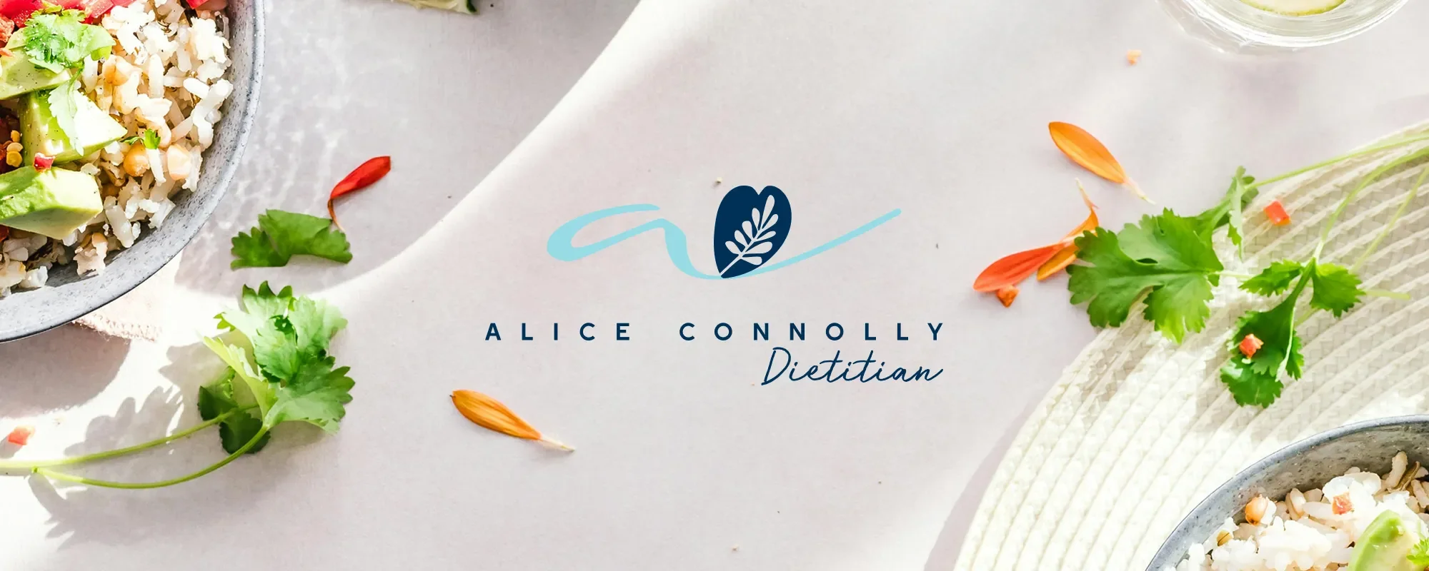
The logo is built around a leaf mark contained within a heart shape. The leaf references nature and nutrition. The heart was Alice’s own instinct: she wanted the mark to convey health and compassion together, and the form that did both was the one she came back to. Running through the mark is a handwritten ‘a’ in flowing script, the signature element of the identity, the thing that makes it feel like it belongs to a person rather than a practice.
The wordmark is set in Forum, spaced and capitalised, giving the name professional weight. ‘Dietitian’ sits below in the handwritten script, tying the two typographic registers together. The balance between formal and personal mirrors the balance Alice strikes in her practice.
The palette is anchored in deep navy and teal: grounded and trustworthy, but not cold. Supporting coral, warm sand, and off-white tones carry across the website, brand board, and collateral, adding warmth without pulling the identity away from its clinical foundations.
-
Alice launched in 2019 and within a few months reported that around half of all new client enquiries were coming directly through the website, with that proportion growing over time. When she returned to private practice in 2021 after a period away, her first comment about the site was that it still looked beautiful. The identity had held across two years without needing to be revisited.
She is back in practice now, working with clients across reproductive health, fertility, and weight management. The brand is still in use, the site is live, and the foundations built in 2019 are still doing their job.
Like the look of this project? Let’s chat here!
If you’re stepping into independent practice and need an identity that does the work for you, I’d love to hear where you’re headed.